Data Science Notes 7: Polynomial regression
Once a variable takes a power above 1 the line becomes a curve. Comparing linear and polynomial regression on the same dataset.
Also available in Turkish This post is a translation.
Contents

My earlier posts in this series:
- Data Science Notes 1, Introduction to machine learning
- Data Science Notes 2, Machine learning and Python
- Data Science Notes 3, Data preprocessing
- Data Science Notes 4, Feature scaling
- Data Science Notes 5, Linear regression
- Data Science Notes 6, Multiple linear regression
Hello everyone. After a long break with no excuse behind it (about eight months) I am back to sharing my data science notes. I hope you enjoy the read.
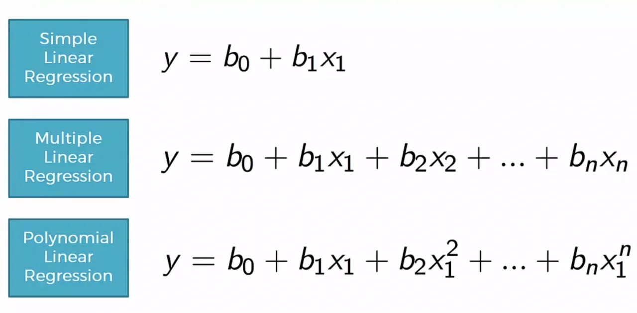
As you know, and as I said in my earlier notes, linear regression and multiple linear regression are types of regression that produce straight and simple equations. By simple I mean that the power of every variable is at most 1. In polynomial regression that changes.
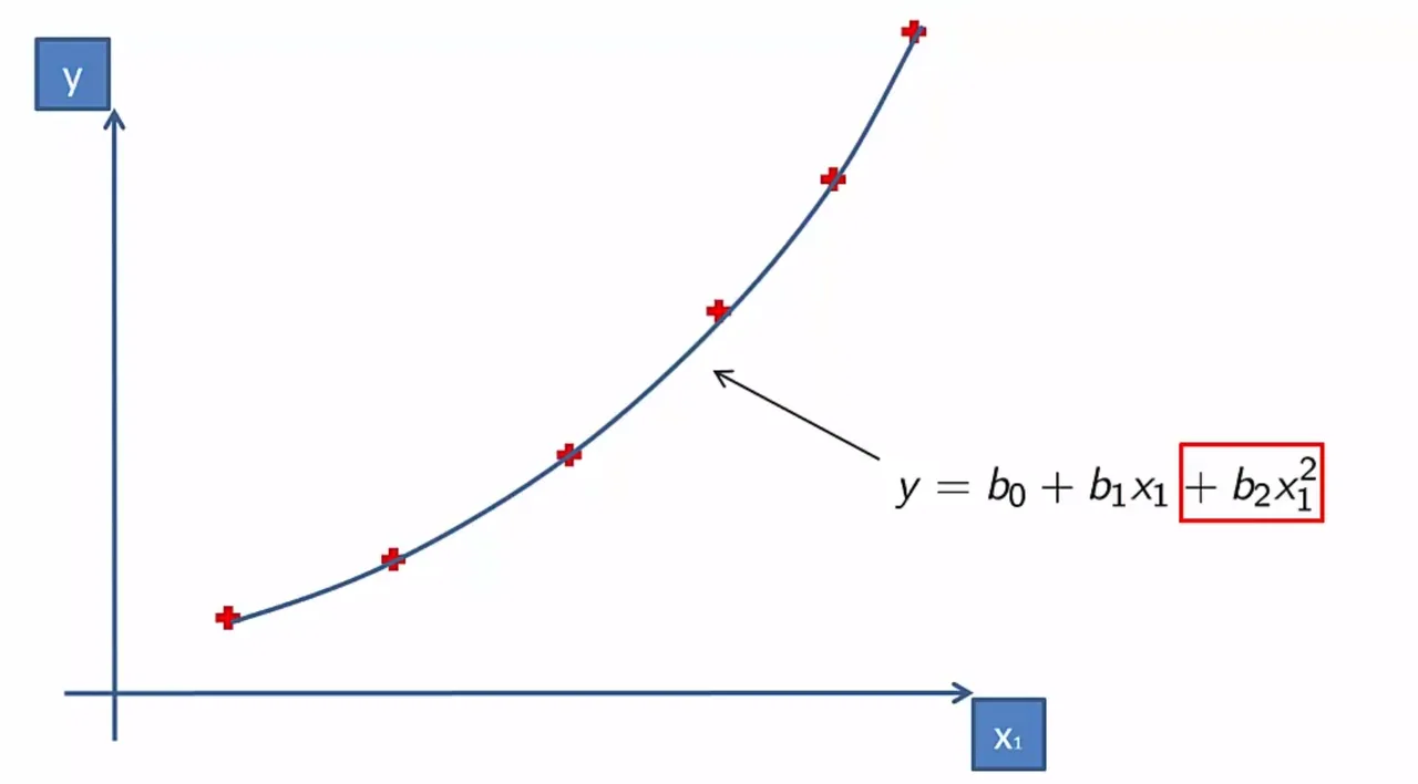
As you see above, how much each variable affects the system changes with its power, and because at least one variable has a power higher than 1 the system is modelled as a parabolic curve. The advantage this gives us is that the system is more flexible in fitting the data than the simple regressions are. So far we have used linear and multiple linear regression to solve many problems, but polynomial regression has uses of its own that make it necessary. Take the spread of epidemics, which is on the agenda these days. Polynomial regression is of course not the only way to analyse it, but it can give us an idea about how a disease spreads across regions and through the population polynomial.
In each of the notes so far we worked through a specific problem. The problem in this one is predicting the annual salaries of the employees of a company operating globally. We will treat the table below as a dataset and then run separate analyses with linear regression and polynomial regression.
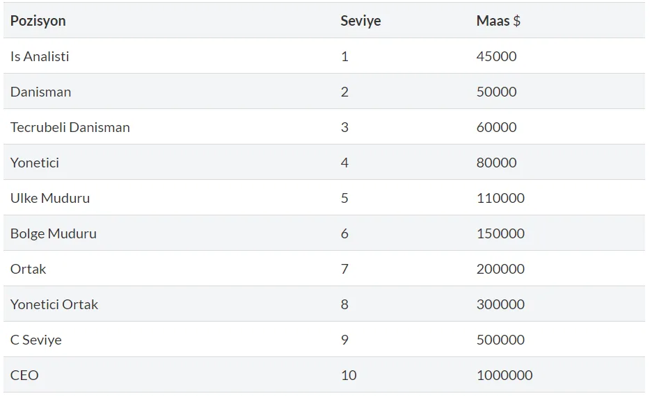
I will share the result charts of the regressions first and, as always, make my comments over the code at the end. Let me start with the chart of the linear regression we saw in earlier lessons applied to this data.
Linear regression analysis
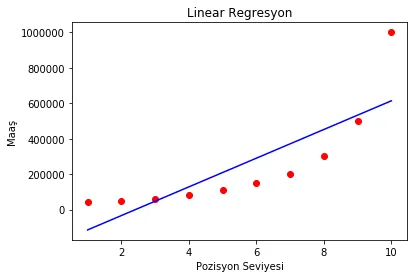
As you see above, linear regression is at quite a disadvantage when predicting data that is not linear. Because the power of its variables is at most 1, it cannot take a parabolic shape, and we can see that using it on datasets that form curves does not make much sense.
Polynomial regression analysis
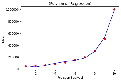
Polynomial regression, having a parabolic shape, can move between the points in the dataset far more flexibly, so to speak. But polynomial regression has fine points of its own that you need to know. For instance you have to set the power of the variables correctly.
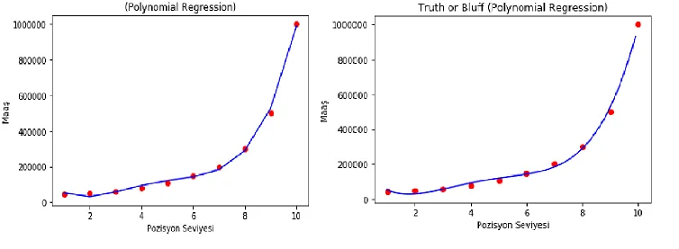
Looking at the two different polynomial regressions above, you will see that the one on the right is more flexible. The reason is that the power value of its variable in the regression is higher than the one on the left. This is the most important thing to watch in polynomial regression. By trying the powers of the variables one by one against the accuracy rate, you can see which power value works best for which variable.
The Python application
With the code we write we will try to produce the charts above, and beyond that we will be able to make a single salary prediction from a position level with linear regression and with polynomial regression.
# Polynomial Regression

# Adding the libraries
import numpy as np
import matplotlib.pyplot as plt
import pandas as pd

# Adding the datasets
dataset = pd.read_csv('pozisyon.csv')
X = dataset.iloc[:, 1:-1].values
y = dataset.iloc[:, -1].values

# Training the dataset for linear regression
from sklearn.linear_model import LinearRegression
lin_reg = LinearRegression()
lin_reg.fit(X, y)

# Training the dataset for polynomial regression
from sklearn.preprocessing import PolynomialFeatures
poly_reg = PolynomialFeatures(degree = 4)
X_poly = poly_reg.fit_transform(X)
lin_reg_2 = LinearRegression()
lin_reg_2.fit(X_poly, y)

# Visualising the linear regression results
plt.scatter(X, y, color = 'red')
plt.plot(X, lin_reg.predict(X), color = 'blue')
plt.title('Lineer Regresyon')
plt.xlabel('Pozisyon Seviyesi')
plt.ylabel('Maaş')
plt.show()

# Visualising the polynomial regression results
plt.scatter(X, y, color = 'red')
plt.plot(X, lin_reg_2.predict(poly_reg.fit_transform(X)), color = 'blue')
plt.title('(Polinomal Regresyon)')
plt.xlabel('Pozisyon Seviyesi')
plt.ylabel('Maaş')
plt.show()

# Making a single linear regression prediction from the position level
lineertahmin = lin_reg.predict([[6.5]])

# Making a single polynomial regression prediction from the position level
polinomaltahmin = lin_reg_2.predict(poly_reg.fit_transform([[6.5]]))
On the results of the Python application
lineertahmin = lin_reg.predict([[6.5]])
The prediction we wrote above comes out as 330378. That is well above the real value.
polinomaltahmin = lin_reg_2.predict(poly_reg.fit_transform([[6.5]]))
The value above comes out around 158862, almost exactly the salary for level 6.5. These predictions show us why polynomial regression matters.
Thank you for reading patiently. With this writing streak, I hope the next post, on support vector regression, arrives before another eight months pass.
Take care of yourselves and stay well.
abdullahfaruk